Why Printed Invites Still Win Donor Attention
Most Valley households open physical mail at far higher rates than email—crucial when you’re courting gifts or volunteer time. A thoughtfully printed invitation card signals that the event matters, that every donor matters, and that your organization respects the personal touch that keeps giving circles tight-knit.
Start With Your Mission, Not the Paper
Before choosing stock, jot down three words that define this fundraiser’s spirit—impactful, hopeful, community-first. Let those words guide color, layout, and even format:
-
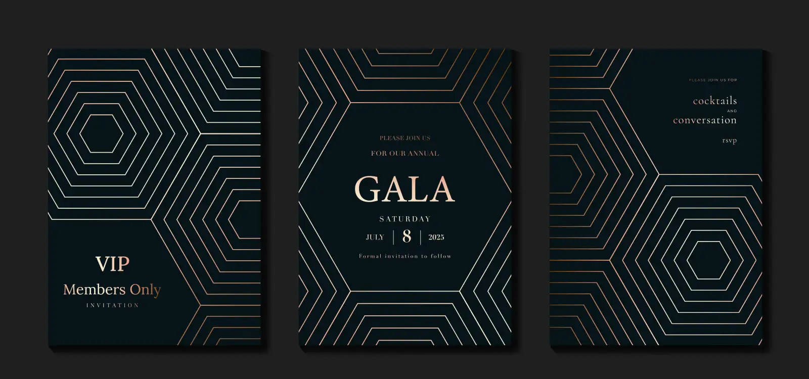
Gala: Jewel tones and copper accents echo a night-of-giving mood.
-
5K Fun Run: Bright palettes and energetic typography convey momentum.
-
Volunteer Appreciation Brunch: Soft pastels and tactile textures feel intimate.
Anchoring every design choice in mission language keeps the piece authentic instead of “just pretty.”
Budgets Are Real—So Pick Stocks & Finishes That Work Hard
|
Choice
|
Why It Matters to Non-Profits
|
Phoenix Proof Point
|
|
120 lb matte cover
|
Affordable thickness that still feels premium
|
Resists curling in summer mailboxes
|
|
Uncoated recycled Kraft
|
Communicates sustainability values to eco-minded donors
|
Pairs nicely with spot-white ink for contrast
|
|
Soft-touch laminate (select areas)
|
Adds tactile luxury without full-card cost
|
Won’t scuff as easily during handling
|
Copper State Shine—Foil Done With Purpose
Use foil sparingly on the organization name, campaign logo, or a donor-level badge. A subtle copper foil nods to Arizona heritage while elevating perceived value—encouraging higher ticket tiers or sponsorships.
Cut to the Cause: Shapes That Tell Your Story
Die-cut a simple heart, sunburst, or saguaro silhouette; it visually ties the invitation to your mission or venue. Remember to budget for the small USPS non-machinable surcharge so there’s no last-minute scramble when mailing thousands of pieces.
Personalization That Thanks Donors by Name
Variable-data printing lets you greet Alex, note last year’s pledge amount, or suggest an upgraded giving level—all within the same print run. Pair this with a QR code that jumps to a pre-filled donation or RSVP form (no tedious typing).
Sustainability That Speaks to Stewardship
Highlighting these choices in a small footer shows donors you steward resources the same way you steward their gifts.
Timeline & Proofing—So Your Appeal Doesn’t Slip
|
Weeks Out
|
Action
|
|
12–10
|
Finalize design and board approval.
|
|
10–8
|
Receive mailed hard-proof; confirm color & cuts.
|
|
8–6
|
Print and address variable data files.
|
|
6
|
Mail First-Class (1–3 days local, up to 5 nationwide).
|
|
2
|
Send reminder email echoing print design and mission story.
|
Stretch the Budget Without Sacrificing Impact
-
Gang-run multiple chapter events on one sheet to hit volume pricing.
-
Digital print + selective foil overlay instead of full letterpress.
-
Utilize nonprofit postal rates—ask us to handle the paperwork.
Fast-Check Design List for Development Teams
☐ Mission tagline present & prominent
☐ Donor name merge tested
☐ Bleeds, die lines, foil clearance set
☐ Non-machinable postage budgeted
☐ Hard-proof signed off by ED or mar-comm lead
Let’s Plan Invitations That Fuel Your Cause
Schedule a 15-minute nonprofit invitation consult at AlphaGraphics. Bring last year’s invite; together we’ll uncover what resonated with donors, outline three budget-friendly paper-and-finish upgrades, and map next steps so your next appeal lands flawlessly—and drives the mission forward.