Professional photography requires more than just talent behind the lens—it demands well-designed backdrops that complement, not compete with, the subject. When photographers struggle with glare, cramped framing, or washed-out logos, the problem often traces back to design choices made long before the first flash fires. Small decisions like pattern scale, material selection, and lighting clearance determine whether your event photos look polished or problematic. This guide translates photographer pain points into clear design and print decisions that anyone can follow, ensuring your step and repeat backdrop becomes an asset, not an obstacle.
What Photographers Really Need From a Backdrop
Photographers work fast at events, often managing long lines and changing lighting conditions. Their biggest frustrations stem from backdrops that fight against their technical requirements rather than supporting them.
First, they need an even, non-reflective surface that maintains consistent exposure across the entire frame. Shiny materials or uneven textures create hotspots that force constant camera adjustments, slowing down the photo line and frustrating guests.
Second, branding must remain readable in tight crops, especially vertical phone shots that have become standard for social media sharing. A logo that looks perfect on a wide backdrop might disappear entirely when cropped to portrait orientation.
Third, photographers require adequate space to light faces without blasting the backdrop. When backdrops are positioned too close to the subject area, lighting spills create unwanted glare and uneven illumination that's impossible to correct in post-processing.
Finally, a predictable standing zone helps photographers frame shots quickly. Clear positioning cues—whether through floor markings or backdrop design elements—keep subjects properly positioned and reduce the need for constant direction.
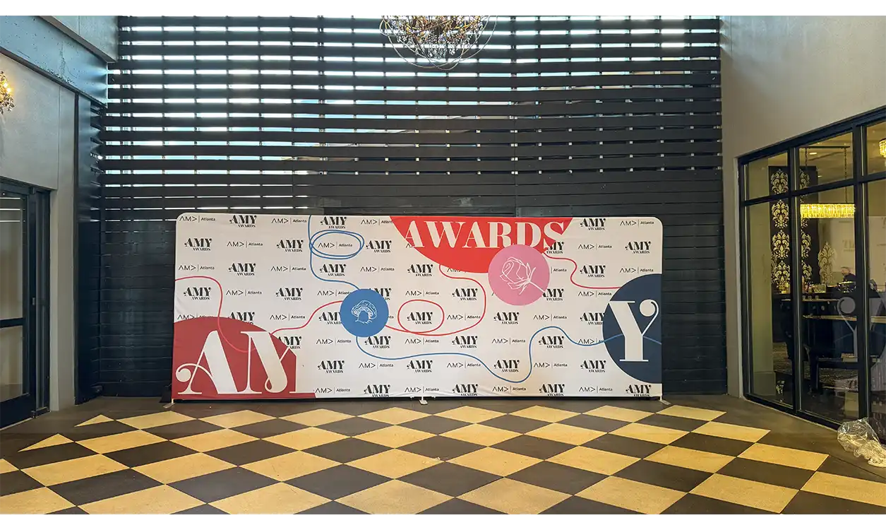
Pattern & Logo Spacing That Survives Crops
Logo sizing makes or breaks backdrop effectiveness in photographs. The golden rule: start with 6-10 inch logo tiles on 8-10 foot walls, scaling up proportionally for larger installations. This size ensures brand visibility even when photos are cropped to vertical formats or zoomed for close-ups.
Grid patterns versus brick layouts significantly impact visual quality. Staggered "brick" patterns reduce the appearance of obvious tiling while keeping at least one complete logo visible regardless of crop boundaries. Grid patterns, while simpler to design, often create awkward partial logos at frame edges.
Edge safety zones prevent logo amputation at backdrop borders. Build in 6-12 inches of buffer space around the perimeter so logos aren't sliced off when photographers adjust their framing. This buffer also accommodates slight backdrop positioning variations during setup.
Before finalizing any design, run crop tests by previewing your layout at 1:1 square ratios and vertical 9:16 formats to simulate Instagram posts and phone photography. If logos become illegible or disappear in these formats, increase the scale or adjust spacing.
Watch out for moiré patterns—those wavy interference lines that appear when fine patterns interact with camera sensors. Avoid ultra-fine details, thin diagonal lines, and repetitive geometric elements smaller than 3-4mm at final print size. When in doubt, test print a small section and photograph it with typical event lighting.
Colors & Contrast That Photograph Cleanly
Color choices directly impact how easily photographers can achieve proper exposure and how well your branding reproduces in final images. Matte, saturated colors photograph most reliably, while pure white and jet black present exposure challenges that slow down shooting.
Pure white backdrops force photographers to overexpose or underexpose either the subject or the background—there's rarely a middle ground that works for both. Similarly, jet black absorbs so much light that subjects appear to float in space, losing the branded backdrop entirely.
Instead, choose neutral mid-tones or rich, saturated colors that provide good contrast without reaching extremes. Navy blue, forest green, burgundy, or warm grays offer professional appearance while maintaining photographic flexibility.
Brand mark contrast should meet or exceed a 4.5:1 ratio for optimal visibility. White text on medium blue backgrounds, dark text on light gray, or colored logos on contrasting neutral backgrounds ensure readability across different lighting conditions and camera settings.
Heavy gradients create banding artifacts under the compression used for web sharing and printing. If gradients are essential to your brand, keep them subtle and test how they appear when photographed and compressed for social media platforms.
Always provide exact color specifications—HEX codes for digital, PMS colors for print, or CMYK values—but accept that print-safe conversions may shift colors slightly from your screen display.
Materials That Don't Glare or Wrinkle
Material selection dramatically affects both photo quality and setup efficiency. The gold standard for photography backdrops is matte tension fabric with a tight knit, often called pillowcase-style mounting. This material combination resists both glare and wrinkles while maintaining color saturation under various lighting conditions.
Vinyl offers durability and easy cleaning but creates reflective surfaces that challenge photographers. If vinyl is necessary for your application, specify matte lamination and plan for softer, angled lighting to minimize glare. Position lights at 45-degree angles rather than straight-on to reduce specular reflection.
Seam placement and frame design keep fabric surfaces taut and professional-looking. Horizontal seams at eye level create obvious lines in photos, so position them above or below the typical subject area. Choose frame systems that provide even tension across the entire surface.
For trade show displays and events requiring transport, plan for proper packing and setup. Roll backdrops rather than folding to prevent permanent creases. Include a handheld steamer in your event kit, or use low-heat stretching during setup to remove minor wrinkles. Severe creases cast shadows that appear in every photo, creating unnecessary post-production work.
Typography & Iconography Built for the Lens
Camera lenses can't capture fine details that look sharp to the human eye, so typography must be bolder and simpler than typical graphic design standards. Maintain minimum line weights of 1.5-2mm at actual print size, avoiding hairline fonts, decorative scripts, or intricate serif details.
Taglines and secondary text should be kept short and treated at a larger scale than you might initially consider. Long website URLs or detailed hashtags become illegible in photographs and clutter the visual composition.
Always supply vector logos in AI, EPS, or SVG formats to your printing provider. If you only have raster images, ensure they're at least 150-300 pixels per inch at the final printed size. Low-resolution logos appear pixelated and unprofessional in high-quality event photography.
Drop shadows, fine outlines, and emboss effects often disappear entirely at viewing distances typical for event photography. These effects also create focusing confusion for camera autofocus systems. Keep logo treatments clean and bold with solid fills or simple gradients.
Lighting-Friendly Design & Layout
Backdrop layout should facilitate proper lighting rather than compete with it. Leave a clean "logo-light gap" of 8-12 inches above where heads typically appear in photos. This space prevents bright lighting instruments from creating hotspots directly behind faces, which causes unflattering shadows and exposure problems.
Position the backdrop at a 10-15 degree angle relative to key lights rather than perfectly parallel. This subtle angle deflects specular glare away from the camera lens while maintaining even illumination across the backdrop surface.
Most professional event photography uses two soft light sources positioned at roughly 45-degree angles to the subject, with an optional subtle hair light from behind. Design your backdrop layout and select materials that work well with this standard lighting setup rather than requiring special accommodation.
Mark the optimal standing position and camera line with low-profile floor decals or tape. These positioning guides help photographers work quickly and maintain consistent framing throughout the event. Consider discrete arrow markings or footprint decals that guide subjects into the ideal position without appearing in wide shots.
Think about event lighting add-ons early in the planning process. Coordinating backdrop design with lighting rental ensures all elements work together seamlessly rather than requiring last-minute adjustments on event day.
Practical Add-Ons Photographers Love
Small additions to your backdrop setup can dramatically improve photographer workflow and photo quality. A carpet runner or clearly marked tape lines help photographers center groups quickly, reducing the time spent positioning subjects and keeping photo lines moving efficiently.
Consider adding a side information rail or small freestanding sign for QR codes, hashtags, or event information. This keeps the main backdrop clean and uncluttered while providing necessary information in a location that won't interfere with portrait compositions.
Stanchions or rope barriers help manage queue flow during peak photography periods. Proper crowd control prevents people from accidentally walking into shots and gives photographers clear sightlines to work effectively.
For multi-day events, plan for backdrop maintenance between sessions. Include cleaning supplies appropriate for your chosen material and basic repair tools for minor issues. A small emergency kit prevents minor problems from disrupting photo schedules.
File Prep & Proofing Checklist
Proper file preparation prevents delays and ensures accurate reproduction of your design vision:
- Vector artwork with all fonts converted to outlines; package and include linked files
- CMYK or PMS color specifications plus a small hard proof if color accuracy is critical
- Final dimensions clearly marked or artwork created at precise scale (e.g., 1 inch = 1 foot)
- 0.5-1 inch bleed on all sides with safe areas marked for critical text or logos
- Export as PDF/X-1a or high-resolution PDF; include a separate JPG proof for quick review
- Include setup notes specifying viewing distance, lighting considerations, and material preferences
Work closely with your design services team to ensure all technical requirements are met before production begins.
On-Site Setup—Save the Shoot, Not Just the Wall
Proper installation determines whether your carefully designed backdrop photographs well or creates problems. Level the frame carefully and apply fabric tension evenly to prevent sagging or pulling that creates shadows and distortion in photos.
Sandbag bases thoroughly and maintain 3-4 feet between the camera position and backdrop, with 2-3 feet of clearance on each side for traffic flow. These distances prevent the backdrop from overwhelming photo compositions while providing adequate working space.
Hide frame shine and hardware with edge flags or black fabric if metallic components might catch light and appear in photos. Small reflective details can create distracting bright spots in otherwise perfect shots.
Take a test shot before the event officially begins. Check exposure balance, verify that logos are sharp and readable, confirm that lighting doesn't create glare, and ensure the backdrop appears properly positioned in the frame. These few minutes of testing prevent hours of problematic photos.
Consider how your backdrop integrates with other trade show displays or banner stands in the same space to maintain visual consistency across your entire event presence.
Mini Case Study: Before and After
A recent corporate event initially planned a thin logo grid printed on glossy vinyl—a design that looked sharp on screen but created numerous photography challenges. The small logos disappeared in vertical phone crops, the glossy surface reflected camera flashes directly back at the lens, and the rigid material showed every mounting imperfection.
The solution: larger logos arranged in a brick pattern on matte tension fabric, with lighting positioned at subtle angles. The result was fewer hotspots, faster photo line processing, and sharper branding visibility in vertical social media crops. Guest satisfaction increased, and the client received significantly more high-quality photos for their post-event marketing.
Get Your Photographer-Approved Layout
Want a backdrop design that photographers will thank you for? Send us your logo and event details—we'll size the pattern appropriately, recommend the right material, and provide lighting setup notes tailored to your space.
Frequently Asked Questions
What tile size keeps logos readable in vertical phone shots?
Start with 6-10 inch logos on standard 8-10 foot backdrops. Test your design at 9:16 vertical crop ratios before printing to ensure at least one complete logo remains visible and legible.
How do we avoid glare when using vinyl backdrops?
Specify matte lamination on vinyl surfaces and position lights at 45-degree angles rather than straight-on. Consider switching to matte fabric if photography is a primary concern.
Can we include QR codes without cluttering photos?
Place QR codes on separate signage positioned beside the main backdrop rather than integrating them into the photo area. This keeps portraits clean while maintaining easy access for guests.
What color backdrop prints best for mixed lighting conditions?
Medium-toned colors like navy blue, forest green, or warm gray provide the best flexibility. Avoid pure white or black, which create exposure challenges under varying lighting conditions.
Do you provide spacing templates for designers?
Yes, we supply grid templates based on your final backdrop dimensions, including safe zones and crop preview guides to ensure optimal logo placement for photography.